Custom icon packs are not all created equal. Many, sadly, introduce more problems than they solve. But every now and then, I stumble upon an icon pack that feels like a genuine improvement rather than a mere taste of novelty. What sets these themes apart?
Default App Icons Are Wildly Inconsistent
Out of the box, app icons tend to look great. Pixel phones do suffer from having Google app icons that over-utilize the same few colors, while Galaxy phones have to contend with balancing Samsung’s own vibe with all the Google apps that come forcibly bundled with the Play Store. But on the whole, these two companies and most other phone makers do a decent job of making sure the icons that ship out of the box look cohesive.
The problem comes when you add in third-party apps. Banking apps can be notorious for having flat, soulless icons with a corporate stamp on top. The same lack of style can be found on the apps that accompany other utilities, like the apps from power companies and car insurance. Even carriers, surprisingly—okay, not surprisingly, thinking back to the history of bad carrier software—do a bad job of this.
If you want your phone’s app drawer to look cohesive and coherent, default app icons aren’t doing you any favors.
Many Icon Packs Completely Disregard Brand Identity
Why don’t most phone makers ship their own icon themes? That’s legally, and ethically, a dicey issue. Whether it looks like it or not, app developers put thought into their icons. It’s part of their brand. They post these app icons on their websites, in product manuals, and in ads on TV or posted around town. To replace that app icon not only robs them of creative control over what their app looks like, but it can confuse users unsure if the app they’ve stumbled upon is the official one or a scam.
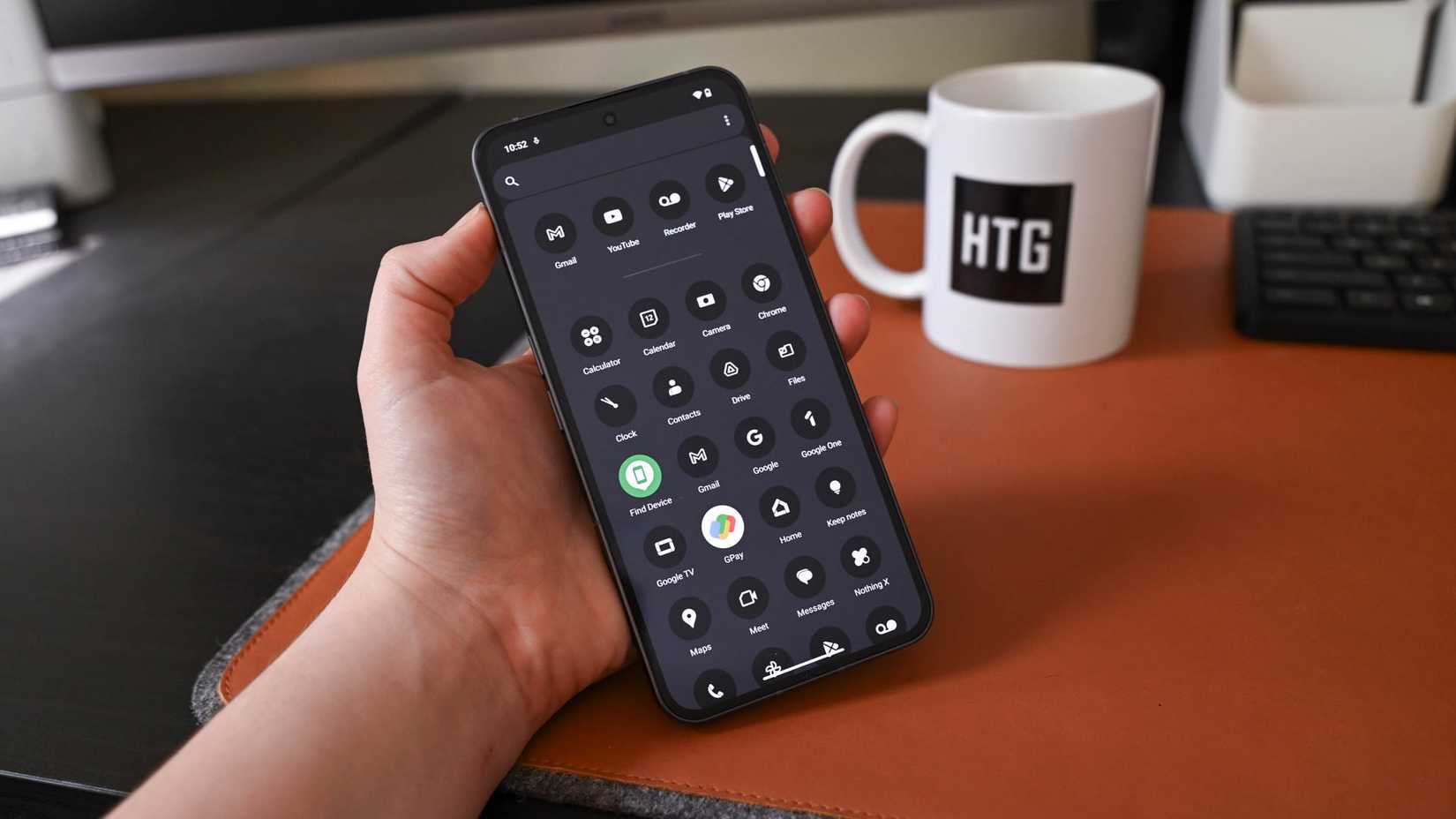
This is why even when a design-focused company like Nothing ships a striking theme for their own apps, they leave third-party apps alone—resulting in a look that falls apart as soon as you download any apps.
When users have to seek out custom packs themselves, they’re aware that their app icons are all going to look different—but they still may not find it ideal when an app with a distinct icon, like Obsidian, gets replaced with a generic pen to denote that it’s a writing app.
Others Make Apps Hard to Tell Apart at a Glance
Some themes (like Nothing’s) lean quite hard into making everything the same color. This is the problem afflicting the custom icon theming baked directly into modern versions of Android and iOS. It may look cool to make all app icons red to complement the volcano in a background wallpaper, but it becomes much harder to quickly tell these icons apart.
This is fundamentally the issue with Google’s own apps. Since they all share the same four colors, you have to pay more attention to the shape of each design. Apple’s Liquid Glass design suffers from this issue even more.
The problem has gotten worse now that most icon themes shape all icons like a circle, squircle, or square. You can’t quickly glance at the shape of an icon but must instead focus on the design within.
It’s About Keeping the Original Vibe, But Making Icons Consistent
Don’t get me wrong—I have a soft spot for both squircles and circles, and I prefer app icons to all be the same shape. I’ve never owned an iPhone, but this is something I think Apple figured out from the beginning.
To get things just right, in my eyes, an icon pack must:
- Make icons fit the vibe of the operating system they’re targeting
- Give icons a consistent shape (or unique shapes for every icon—but not a mix-match)
- Preserve the original brand identity
To summarize is a single sentence: I like icon packs that don’t make it obvious I’m using a custom icon pack.
A Few Examples
Consider icons that defy typical mobile conventions. There’s Ecovacs, which places a “home” badge at the bottom of its icon. Then there’s Photo Studio that has a “pro” badge if you’re using the paid version. A custom icon pack can get rid of both of those. I’m currently using the One UI Icon Pack from JustNewDesigns, and it does a good job of cleaning up both icons.
Then there are icons within an icon, like those for Microsoft Word and Google Docs. The former looks like Microsoft merely dragged a DOCX file into a squircle and called it a day. Many app icons are logos within a squircle, but these two mobile app icons are actually desktop icons inside a squircle. It makes both look like the desktop version is the beloved version and the mobile app is merely a companion. There are ways to make both embrace a squircle without losing their identity.
While it’s easy to completely replace default icons with a custom icon pack, that isn’t always necessary. Sometimes it’s enough merely to use a custom pack to replace the problematic app icons and leave the rest as is.
If you want a custom icon pack that’s wildly different and playful—have fun! I love this about you. But for me, I most enjoy themes that feel like they’re solving a problem rather than expressing my identity. In other words, I’d prefer the default icons to be ideal enough that I’d never think of seeking out a custom icon in the first place. In the absence of that, I’m glad there are icon packs that can do justice to even the most egregious of app icons.

