Whether you’re looking to boost your spreadsheet efficiency, elevate your data analysis capabilities, or improve your career prospects, learning new tricks in Microsoft Excel is sure to help you along the way. So, add these six Excel hacks to your toolkit today.
6
Add a Bar Chart Without Inserting Any Graphics
One of the first things we’re taught in Excel classes at school is how to use data to create a chart. Although this is an invaluable skill to have in your arsenal, sometimes, it’s more useful to visualize your data without the bells and whistles attached to Excel charts.
Related
2 Ways to Quickly Visualize Your Excel Data Without Using Extra Space
Data bars and sparklines are the way forward!
In this example, the bar chart takes up too much space, and the bars don’t align with the spreadsheet rows.
That’s where conditional formatting and the REPT function come in handy. Let’s explore these two hacks individually.
Creating Bar Charts Using Conditional Formatting
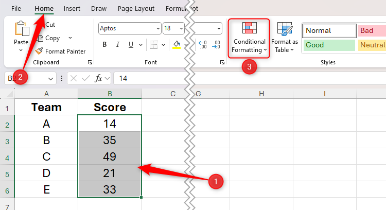
To create in-cell bar charts using conditional formatting, select the cells containing the values, and in the Home tab on the ribbon, click “Conditional Formatting.”
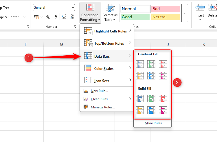
Then, hover over “Data Bars,” and select a fill type.
Now, the cells you selected are partially filled according to their relative values in the dataset. The largest value is represented by a fully filled cell, while only zeros will be completely empty.
What’s more, if the values change, so do the lengths of the data bars.
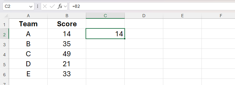
However, maybe you want the data bars to be next to the cells containing the values. In the screenshot above, that would mean that column B contains the values, and column C contains the data bars. To do this, first, select cell C2, type:
=B2
and press Ctrl+Enter to stay in the same cell.
Now, double-click the fill handle to duplicate the formula down the column.
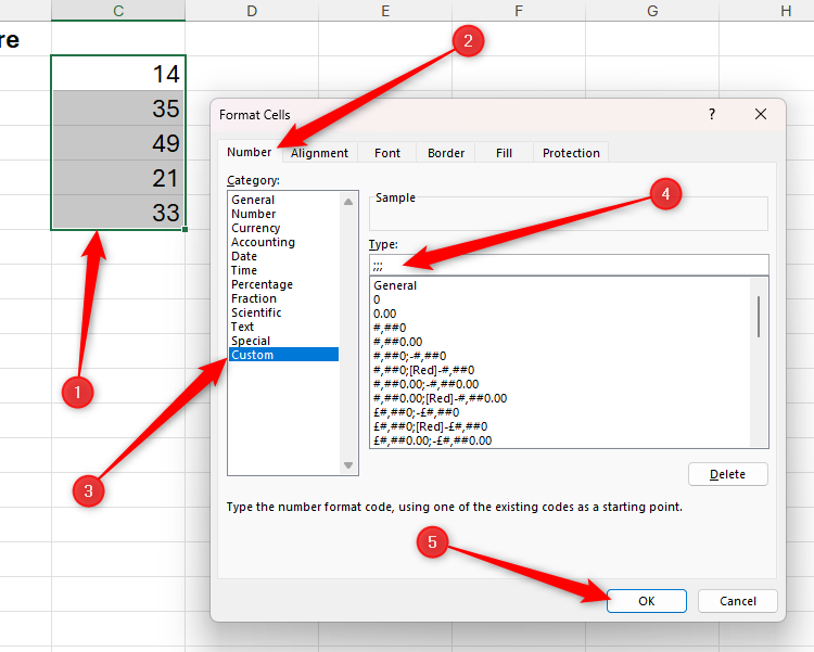
Next, select the duplicated values you just generated, and press Ctrl+1 to open the Format Cells dialog box. Then, in the Number tab, click “Custom,” type ;;; (three semicolons) into the text field, and click “OK.”
Related
Need to Hide Cell Values in Excel? Use This Little-Known Tweak
Keep the cells but hide their content.
Even though the cells in column C appear empty, they still contain the values you duplicated from column B earlier—they’re just invisible.
Now, apply the conditional formatting data bars to the cells containing the invisible values.
Creating Bar Charts Using the REPT Function
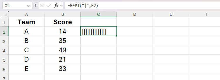
Another way to create in-cell bar charts is to use the REPT function, which repeats a specified character a given number of times.
In the cell next to the first value you want to visualize, type:
=REPT("|",x)
and press Ctrl+Enter.
In this formula, “|” is the vertical glyph character (enclosed in double quotes) often accessed by pressing Shift or Fn at the same time as the relevant key, and x is a reference to a cell containing a numerical value. Here, the formula references cell B2 and so returns 14 vertical glyphs.
If the values you’re visualizing are percentages, add *100 to the formula inside the closing parenthesis.
Double-click the fill handle of that cell to repeat the formula down the column.
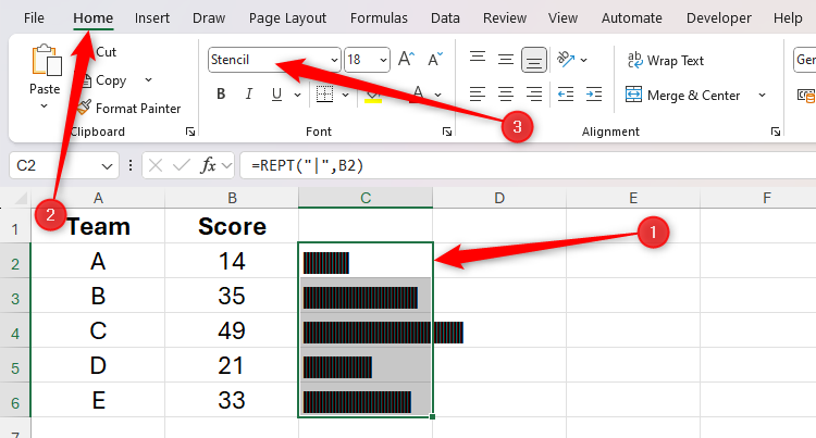
At the moment, the data is visualized as a tally graph, as the default fonts in Excel place small spaces between each character. To fix this, select the relevant cells, and in the Home tab on the ribbon, select a typeface that doesn’t separate characters with a space, like “Stencil” or “Playbill.”
Where data bars adjust to the column width, bar charts created using the REPT function expand or contract dynamically, regardless of the width of the cells they occupy.
Use the settings in the Font group of the Home tab to change the color and size of the bars created through the REPT function.
5
Debug Your Formulas With Precedents and Dependents
I’ve lost count of the number of emails I’ve had from coworkers and readers asking me why their Excel spreadsheet formulas aren’t working. Most of the time, I’ve solved the issue in just a few seconds by tracing precedents and dependents.
Before I show you an example, let me take a moment to explain what I mean by precedents and dependents:
- Precedents: These are cells that contribute to a cell’s value. For example, if the formula in cell C1 is =SUM(A1+B1), the precedents for cell C1 are cells A1 and B1.
- Dependents: These are cells that use a cell’s value. Using the same example, cell C1 is dependent on cells A1 and B1.
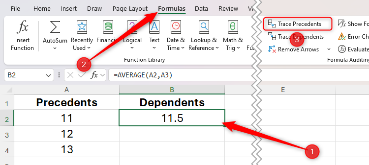
Let’s see this in action in a very straightforward example. Imagine you created a formula in cell B1 that was supposed to average the values in cells A1 to A10. However, you later realize that the result isn’t what you expected.
To debug this formula, select the cell containing the formula, and in the Formulas tab on the ribbon, click “Trace Precedents.”
Straightaway, the arrows tell you that the precedent cells are cells A1 and A2, revealing that you accidentally forgot to include cell A3 in the formula.
Similarly, you could select each cell in column A and click “Trace Dependents” to see which cells use its value in a formula.
To clear your spreadsheet of the arrows indicating the precedent and dependent cells, click “Remove Arrows.”
4
Create and Use Custom Lists
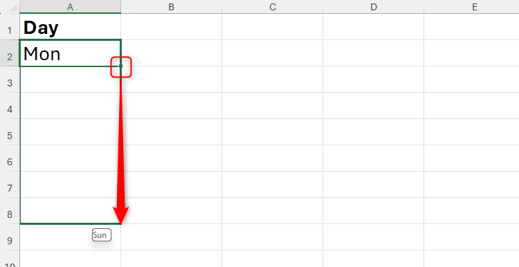
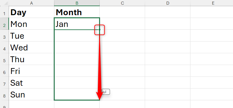
Microsoft Excel recognizes that if you type Mon in cell A1, you’re likely to type Tue in cell A2, Wed in cell A3, and so on. As a result, you can click and drag the fill handle to automatically complete this list.
The same applies to months of the year: if you type Jan, Excel assumes that the next value will be Feb when you click and drag the fill handle downward.
The fill handle works both down columns and across rows.
You can take advantage of this automation by creating your own custom lists.
Related
How to Create a Custom List in Microsoft Excel
Create custom lists in Excel to save time on data entry when entering the same items on multiple spreadsheets.
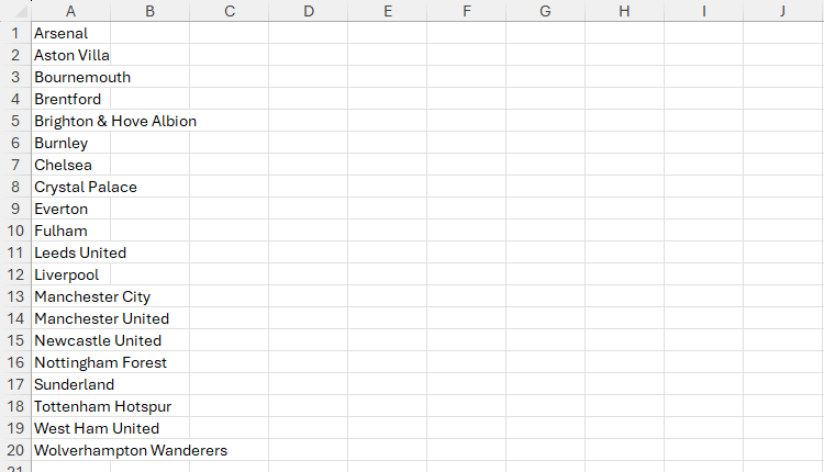
For example, imagine you work for the Premier League in England, and you find yourself always typing the team names manually. Stop right there, because you can make Excel do the hard work for you.
First, type the list once in full in an Excel worksheet, or import it from another source.
Make sure the list is sorted in a memorable order, such as alphabetically or chronologically. This will make remembering the first item in the list much easier in later steps.
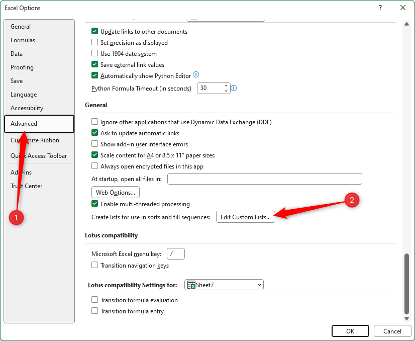
Next, click “File,” and on the Excel welcome screen, click “Options.”
Now, select “Advanced” in the left-hand menu, and scroll down to find and click “Edit Custom Lists.”
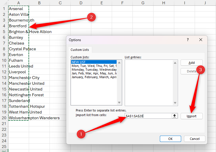
Then, click the empty “Import List From Other Cells” field, select the cells containing the list you want to create, and click “Import.”
Once you’ve imported the list, close the two dialog boxes by clicking “OK” twice.
Finally, go to the spreadsheet where you want to generate the list, type the first item, and click and drag the fill handle until all the items in the list are displayed.
If you drag the fill handle beyond the number of cells required for the list, the list will start again, and the items will be repeated.
3
Save Time by Using the Navigation Pane
Navigating between worksheet tabs in the horizontal menu at the bottom of the Excel window can be time-consuming and frustrating, especially if there are lots of worksheets in the workbook.
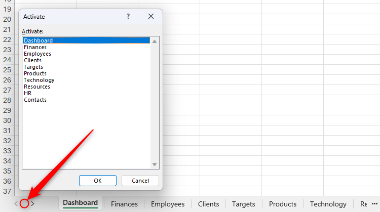
One way to overcome this issue is to right-click the navigation arrows in the bottom-left corner beneath the cell area to launch a vertical list of the worksheet names.

Related
6 Cool Right-Click Tricks in Microsoft Excel
Don’t let your right mouse button go to waste!
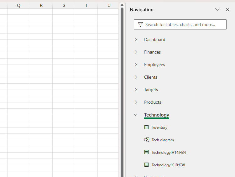
However, my preferred method is to use Excel’s Navigation pane. This is because, as well as displaying the worksheet names, it lists the tables, charts, named ranges, and other elements in each worksheet, essentially acting as a dynamic menu of everything in your workbook.
To activate the Navigation Pane, open the “View” tab on the ribbon, and click “Navigation.”
Now, in the Navigation pane, click any of the sheets to jump straight to them, or click the arrows next to the sheet names to navigate to a specific element.
Right-click a sheet, graphic, or table in the Navigation pane to rename it. Also, if you can’t remember the location of a particular item, search for it in the search bar at the top of the pane.
2
Fix Broken Percentage Formatting
If you’ve ever tried changing a whole number to a percentage in Microsoft Excel, you’ll know all too well that the program doesn’t make it easy to do.
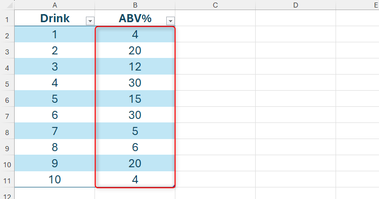
For example, imagine you’ve been sent this spreadsheet, and you want to turn the values in column B into percentages.
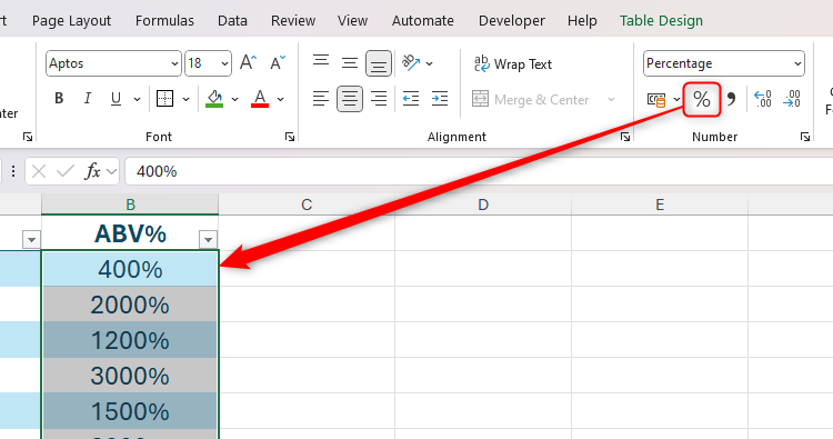
If you select the relevant cells and click “Percentage” in the Number group of the Home tab on the ribbon, since the values are whole numbers, they’ll convert to larger percentage values than you were hoping for.
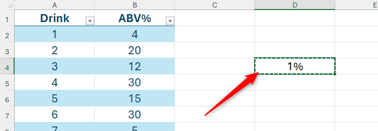
To overcome this issue, with the whole numbers in their original format, type 1% into a blank cell, and press Ctrl+C to copy it.
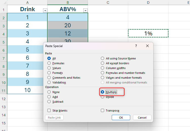
Now, select the cells containing the values you want to convert from whole numbers into percentages, and press Ctrl+Alt+V to launch the Paste Special dialog box. Then, press M to activate the multiplication operation, and press Enter.
Related
4 Paste Special Tricks That Will Save You Time in Microsoft Excel
Paste Special in Excel can do more than paste values.
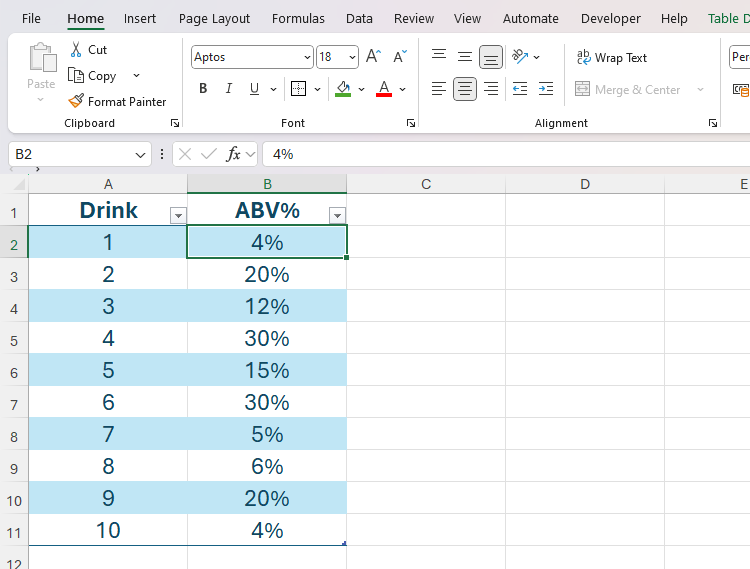
Now, all the whole numbers are converted to their intended percentages.
At this point, you can clear the influencer cell, as it’s no longer linked to the values in column B.
1
Capture Dynamic Snapshots of Your Data
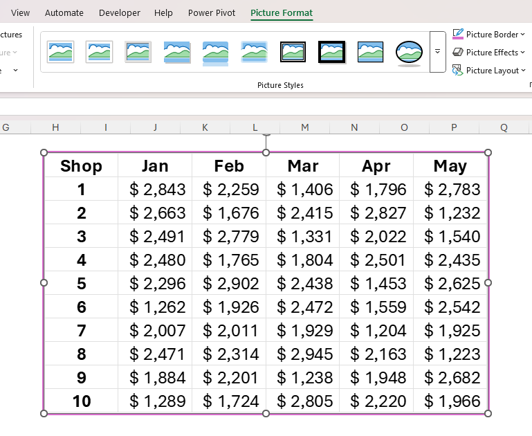
If you’re creating a dashboard of key data, this tool is one you simply cannot overlook. Excel’s Paste As Linked Picture tool lets you duplicate a dataset as an image, meaning you can format and reposition it so that it looks the part. What’s more, the pasted image is dynamic, meaning it updates to reflect any changes in the original data.

Related
Your Excel Spreadsheet Needs a Dashboard: Here’s How to Create One
Have your KPIs in one place.
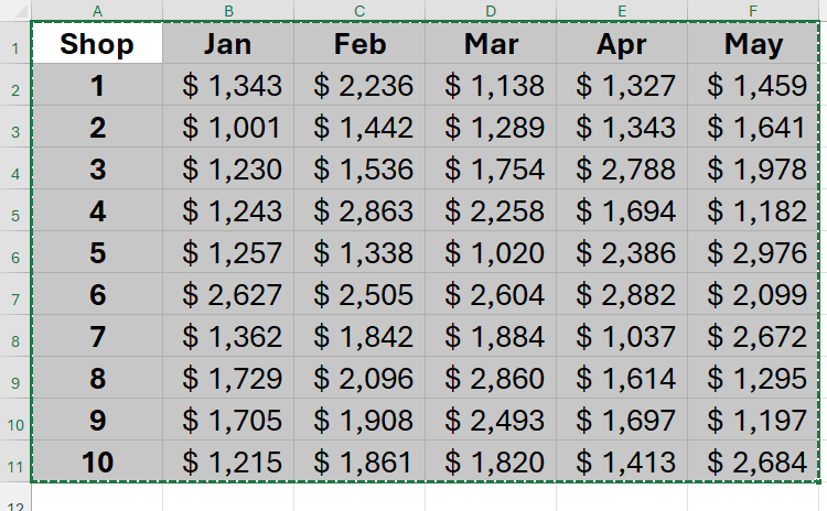
To make use of this tool, first, select the range of cells containing the data you want to capture, and press Ctrl+C.
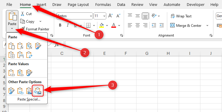
Now, head to the sheet where you want the dynamic picture of your data to be inserted, and click the “Paste” down arrow in the Home tab on the ribbon. Finally, find and click the icon that looks like a clipboard with a linked chain and an image.
Unlike normal images, those created using the Paste As Linked Picture tool are dynamic, meaning they update to reflect any changes in the original data. At the same time, they behave like normal pictures in terms of their positioning, resizing, and formatting. Indeed, you can click and drag the image to move it (or the handles around the edge to resize it), and reformat the picture by selecting it and heading to the “Picture Format” tab on the ribbon.
Uncheck “Gridlines” in the View tab on the ribbon to add clarity to the pasted image.
To duplicate other elements—like charts or formatted tables—as an image, use Excel’s little-known Camera tool.
Related
If You Don’t Use Excel’s Hidden Camera Tool, You’re Missing a Trick
Produce a dynamic image of your data.
Now that you’ve picked up some handy Excel hints, determine your level of expertise by taking the beginner, intermediate, and advanced How-To Geek skills tests!

