If you’ve been using Windows for a while, you probably remember the days when the operating system felt… well, friendly. It had quirks, sure, but it also had a sense of familiarity and control that made it easy to love.
But somewhere along the way, things shifted. In Microsoft’s push to modernize Windows, many of the small, thoughtful touches that once made it special have been stripped away. Handy tools were simplified or buried, familiar menus replaced with flashier ones that take longer to use, and customization options quietly removed.
5
Built-in troubleshooters
When Windows actually knew how to fix itself
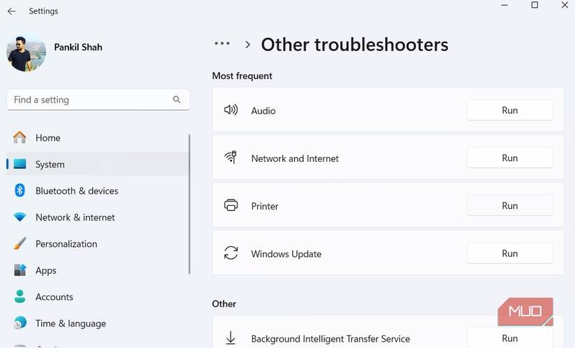
While using a Windows PC, you’re bound to run into little gremlins from time to time. Maybe your speakers stop working, your printer refuses to print, Bluetooth goes missing, or your Wi-Fi connection suddenly vanishes into thin air. In moments like these, Windows’ built-in troubleshooters used to be lifesavers.
You could simply open the Settings app, pick the right troubleshooter, and let it work its magic. Half the time, it even fixed things on its own. But somewhere along the way, Microsoft quietly took that simplicity away. The old troubleshooters have been replaced with the new Get Help app, and now, when you try to run one, it just redirects you there instead.
Instead of instantly diagnosing issues, the app now walks you through a series of robotic questions, asking for permissions and—more importantly—requiring an internet connection to help fix network problems. It’s a real shame because those classic troubleshooters were fast, offline-friendly, and surprisingly competent. They gave you confidence that Windows could take care of itself.
4
Control Panel
The Settings app still can’t fill its shoes
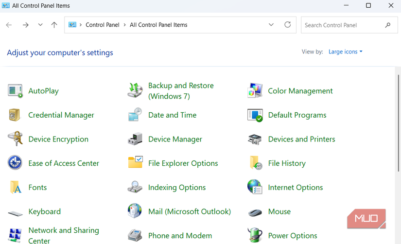
Ah, the Control Panel. Any long-time Windows user knows it was the heart and soul of Windows customization for decades. It was the go-to place for everything from system settings and display options to user accounts, devices, and more. If you wanted to fine-tune your PC, this was where you went.
For years, Microsoft has been slowly chipping away at the Control Panel, nudging everyone toward the newer Settings app. The problem is, the transition still feels unfinished. Some settings have made the jump completely, while others remain tucked away in the old Control Panel. To make matters worse, a few options bounce you back and forth between the two menus.
If Microsoft truly plans to retire the Control Panel, it should at least make sure the Settings app is ready to take over completely. Until then, a lot of us will keep clinging to that little blue icon and hope it never goes away.
Two clicks where one used to do
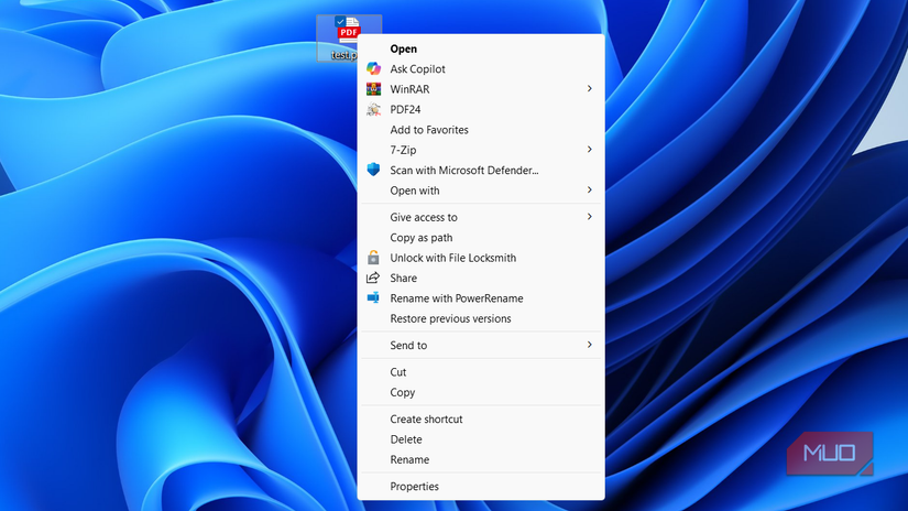
I think I speak for everyone when I say we used to take the right-click menu for granted—until Microsoft ruined it in Windows 11. For decades, that simple menu was one of the most efficient parts of using Windows. It gave you instant access to everything you needed: copy, paste, rename, “open with,” properties, and all those handy third-party shortcuts you’d added over the years. It was fast, familiar, and got the job done without fuss.
Then Windows 11 came along and decided it needed a makeover. And honestly, it’s been a disaster. The new menu looks sleek, sure, but it hides common options behind a Show more options button, which just opens the old right-click menu anyway. So now, instead of a single, efficient menu, you’re stuck with two layers.
The change feels like a solution in search of a problem. The new icons are pretty, but they came at the cost of usability and speed. And while Microsoft has promised improvements, the right-click menu still feels like a downgrade disguised as an upgrade.
2
Start menu and taskbar
A “modern” makeover that missed the point
Few things are more iconic in Windows history than the Start menu and taskbar. They’ve been at the core of the Windows experience since the ‘90s. It’s something everyone interacts with.
Then Windows 11 came along, and Microsoft decided to “modernize” them. In the process, they stripped away much of what made these features great. The Start menu now feels like a minimalist app launcher rather than the robust hub it once was. Customization options are scarce, search highlights feel unnecessary, and to top it off, it even shows ads.
The taskbar didn’t fare any better. Gone are the days of moving it to the top or sides of the screen, resizing it, or pinning files and folders for quick access. What used to be a flexible, user-friendly space is now rigid and overly simplified.
1
Setup with local account
Freedom? Only if you fight for it
Windows has always offered flexibility of choosing between a local account or a Microsoft account. For years, that choice meant you could use your PC the way you wanted.
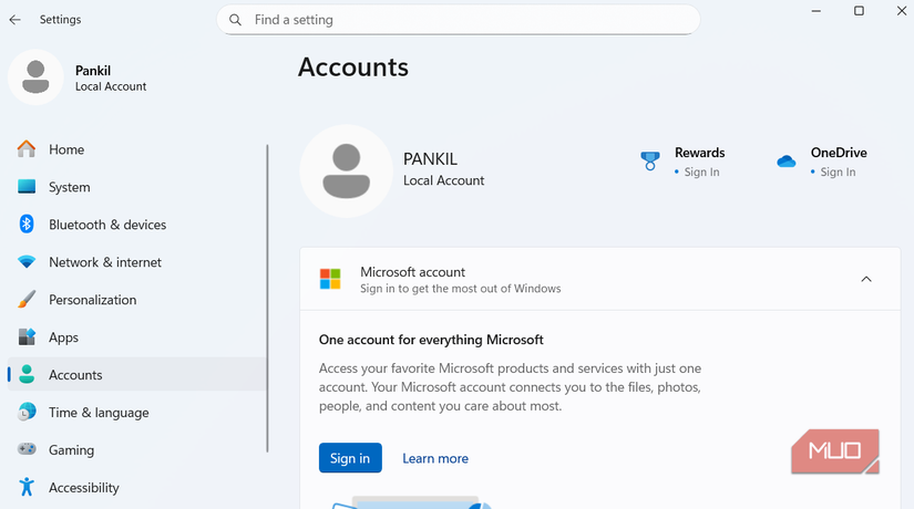
That freedom has all but disappeared in recent versions of Windows. Microsoft now strongly nudges—or in some cases outright forces—you to sign in with a Microsoft account. During setup, there’s little choice: you are pushed to create an account, and skipping it feels like a battle.
Even if you manage to stick with a local account, the experience feels limited. I recently tried using a local account on Windows and quickly ran into roadblocks. Downloading apps was more complicated, key AI-powered features were unavailable, and lacked useful features like Passkeys.
All in all, many features that once worked beautifully have been simplified, buried, or replaced with clunkier versions that favor looks and integration over usability. Of course, not all change is bad. Some updates have genuinely improved performance and security. Still, for those of us who’ve used Windows long enough to remember its golden years, it’s hard not to shake that sense of nostalgia.


