Joe Maring / Android Authority
TL;DR
- Samsung is testing new design changes with One UI 8.5, and the latest leak hints at redesigned icons.
- Like other UI elements, app icons in One UI 8.5 have adopted a 3D appearance.
- The icons appear slightly raised due to a drop shadow behind them, reminiscent of app icons from the Galaxy S6.
Development on Samsung’s next major update for mobile devices is in full swing. An uncontrollable stream of discoveries from leaked One UI 8.5 builds has already revealed numerous new features or upgrades we can expect from the update. Last month, we saw hints that Samsung was preparing for iOS-inspired design changes in the Settings app, followed by a comprehensive leak that showcased the extensive customization options. And today, we’re learning about changes to the app icons.
Ditching the flat design that One UI has had for several years, Samsung is switching to a 3D appearance for icons. Leaker Ice Universe presented updated visuals of the app icons earlier today on Weibo. Take a look for yourself:
This change aligns with the recent updates to the settings app, where bubbles containing different menu options appear slightly raised. A drop shadow can be seen behind all of these elements, including the new set of icons, confirming the shift.
Don’t want to miss the best from Android Authority?


While the system apps look noticeably different, Samsung also appears to be applying the effect to icons for other popular apps, including YouTube and the Google Play Store, as well as a variety of third-party apps.
The media shared by Ice Universe on Weibo showcases these icons applied consistently, which is impressive compared to Google’s half-hearted support for themed icons in Android.
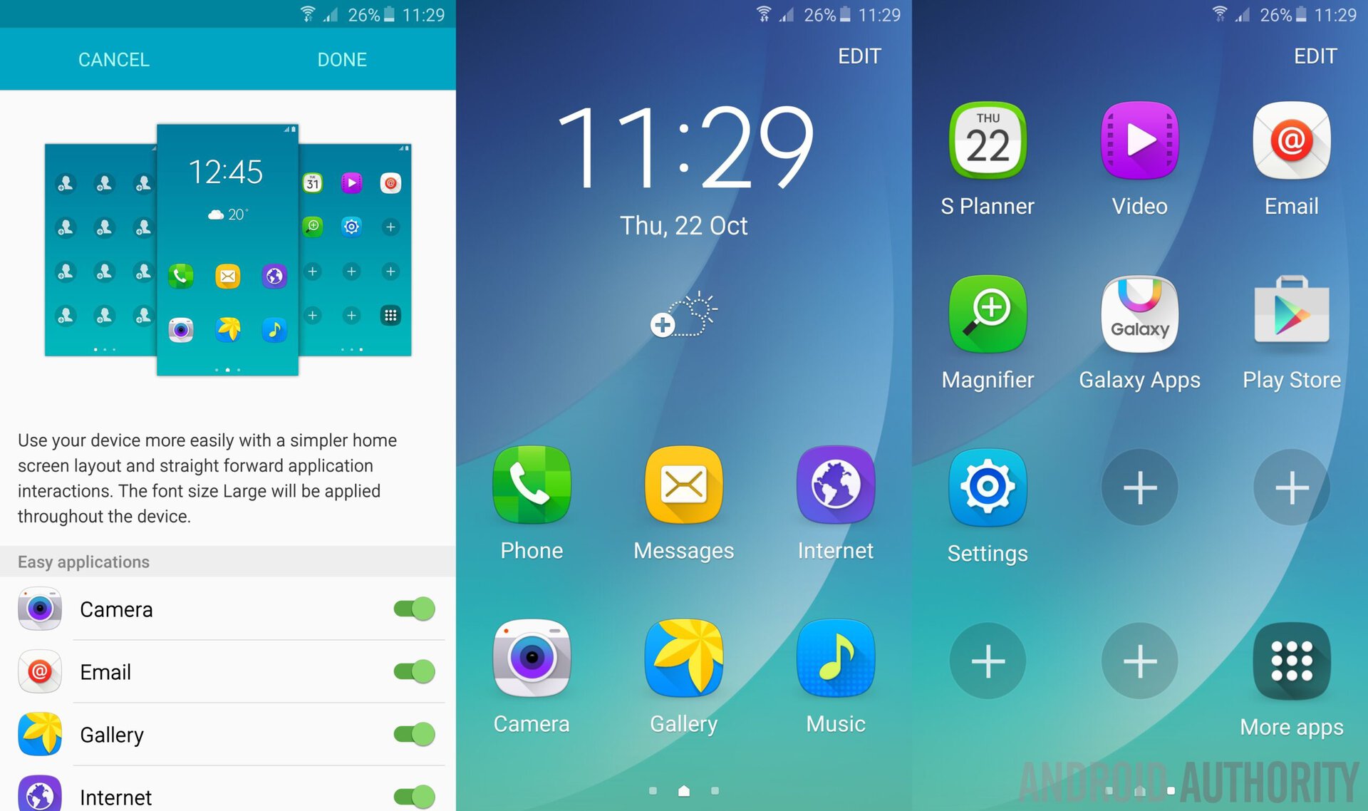
Notably, this isn’t the first time Samsung has been dabbling with 3D icons. If you’re a long-time Samsung user, you might immediately be reminded of later versions of Samsung’s Touchwiz interface. However, it is not to assert that Samsung is returning to an older design for icons, and we can expect them to be more refined than earlier and complement the modern UI.
Look at these icons from Galaxy S6, running Touchwiz version 6, based on Android Lollipop:

Once again, Apple has also opted for a 3D appearance for icons with iOS 26 with its “Liquid Glass” design philosophy. Naturally, the heavy 3D rendering can be seen stressing the hardware on phones during the pre-release builds, and Ice Universe states that the icons have wreaked havoc on the battery life. Whether Samsung’s 3D icons are good is contentious, but we hope it irons out excessive battery consumption due to this change.
Thank you for being part of our community. Read our Comment Policy before posting.