My Readwise notes and Obsidian web clips have dozens of entries sitting in my vault, but honestly, I have no idea what half of them say anymore. The file explorer just shows me a depressing wall of filenames that all blur together. I know I saved something brilliant about productivity habits back in March, but good luck finding it without remembering the exact title. My Obsidian inbox basically lives in a black hole instead of being useful.
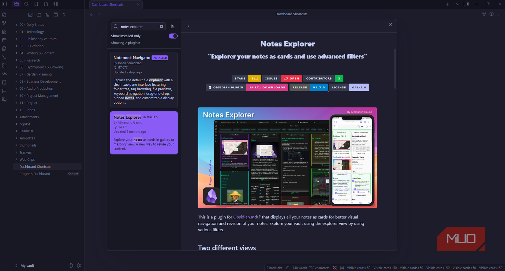
What I really wanted was something dead simple: let me scroll through my notes like I’m browsing Instagram, where I can actually see what I saved instead of guessing from filenames. After trying out a few dashboard and card plugins, I found Notes Explorer to be my favorite. Now my Obsidian vault looks like an actual gallery, where my Readwise saves, web clips, and other entries sit on cards I can browse, color-code by topic, and filter down to exactly what I want.
Why prefer Notes Explorer over other similar plugins
It combines visual appeal with actual power features
While I do like using Notebook Navigator to add extra visual cues to my Obsidian vault, sometimes I just want to have a full dashboard view of notes from my vault. There are quite a few card plugins available in Obsidian, but I noticed most were either nice to look at with limited functionality or powerful but ugly. Notes Explorer is the first one that gave me a good balance of both.
The first time I opened it, I just stared at my screen for a minute because it looked so different. My vault went from looking like a boring phone book to a Pinterest board. Every note sits on its own card showing the title, a chunk of the actual content, and details like when I created it. All my vault notes are now spread across the screen in a masonry layout where different card sizes fit together like puzzle pieces. But unlike other visually appealing plugins, Notes Explorer also includes serious organizational tools, search filters, boolean logic, and saved views, making it genuinely useful beyond just looking nice.
How I turned my vault into a visual dashboard
Color coding my notes automatically
Notes Explorer offers plenty of utilities and features, but the visual ones are what I appreciate most because they save me a lot of mental energy. Aside from having a dashboard-style view, I love that Notes Explorer can automatically map my notes with colors based on their tags.
To set this up, I went into Settings, scrolled to Notes Explorer, found Tag Colors, and assigned orange to unprocessed, green to Readwise, and blue to news. Now, unprocessed notes have orange strips along their edges, Readwise saves in glowing green, and news notes pop in blue.
I use card sidebar mode, where a thin colored strip sits on the card edge with just a hint of background tint. It’s far more readable than using a full background color. I also set tag priority by dragging tag colors to avoid conflicts when an entry has multiple tags.
Search filters that work like building a database query
Notes Explorer provides powerful search and filtering options to locate any note in my vault. The easiest way to find my Readwise highlights and Obsidian web clips turned into a library is to click one of the tags already listed at the top of the dashboard. This gives me a shortcut to notes that use the common and recent tags I frequently apply.
If I want to see notes that don’t use the tags already displayed, I can use the search bar at the top right of Notes Explorer. When I click it, a dropdown opens with filter options like filename, folder, content, tags, creation date, modified date, and front matter properties. What makes this search bar powerful is that it allows me to combine multiple filters using Boolean logic.
Let’s say I want to filter my completed notes by multiple tags, creation date, and author. I click on the search bar, select the tag, and enter #readwise, #completed, and #jayric. Then I set date-created-after to 1/15/2025. After hitting Enter twice, I got 50 results, which isn’t what I expected.
Since these filters use OR logic by default, it means that as long as a note meets any of those tags or was created after 1/15/2025, it appears in the results. That explains why I got more results than I wanted.
This is where compulsory filters come in. These filters use AND logic, meaning they show only entries that match all selected properties. To turn on a compulsory filter, I just click the lock icon beside each property.
Now I only see two cards, both are completed articles created after 1/15/2025 from my Readwise highlights linked to my Obsidian vault.
One-click dashboards
Since you can create complex compulsory filters, Notes Explorer lets you save time by creating link views. To do this, I simply click the share button in the top-right corner. Notes Explorer generates an Obsidian URI link, which I paste into a new note titled Dashboard Shortcuts. Now, whenever I click that link view, Notes Explorer opens with those exact filters already loaded.
I’ve created a few saved views this way. One shows interesting tech articles I haven’t processed yet, another links to DIY projects I want to try in the future, and a third gathers AI research papers.
Your notes deserve better than filenames
I used to save highlights and then never look at them again because finding them felt like too much work. Notes Explorer changed that completely. Now I actually browse through my notes for fun because I can finally see what’s in them. If you’ve got hundreds of notes collecting dust, this plugin helps you remember why you saved them in the first place. Your vault becomes something you explore instead of something you avoid.


